
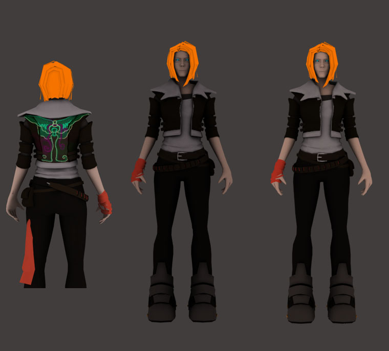
This is where Vivis outfit and texture progressed. The image above shows crit. I received from our theory teacher who rightly so pointed out a fashion sense too similar to what we'd find in H&M or Topshop. He said to spice it up with the neon that features in their world, make her pop out to us.... she is after all the main character.
So we looked at how we could bring neon into her design. Further research was made!

This was more along the lines of what I was looking for, but she is still looking horribly bland.
Too dark.
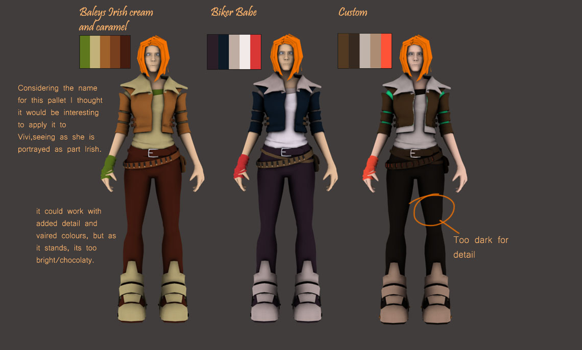
This was attempt one, find colour schemes and apply a limited colour palette to the texture map.
A great website for getting colour swatches is Kuler: http://kuler.adobe.com/
It allows you to take a certain amount of colours from an image or generate colours to a theme. Give it a try!

As shown before, this image above shows what the colour scheme was that i planned to aim for. Dark grungy colours with bits of neon colours breaking up the dullness.
No comments:
Post a Comment