Model by Ceri Rogers, texture by Me


The only real concern with the Gramos Kid model is its poly count, mainly centred on the models arms. However, the arms were needed to act as an obvious link between Gramos and the kids and so this was allowable.


The final outcome was a success, with the model looking like the concept and supporting a finished texture set, as well as a respectable completion time of five days.
Even though the model was a C priority, it gave me a break from the overly detailed and complicated models beforehand, allowing me to enjoy an easy enough task, which point brought about a decent end result.


The Gramos Kid is a creation of Gramos himself, made to act as helpers, he built so many of these kids that Gramos and his kids are now known as an independent gang.
The concept was aimed at creating a miniature version of Gramos that can be mass produced. I went with a kid design to give this gang a Santa Claus theme with his little helpers.


In the end, the model for Gramos turned out both unsuccessful and successful. With the model looking like its concept it was able to tick that box, but due to its complexity there were numerous faults and not enough time was spent on texturing.


This is the texture that was intended for Gramos, his clothing was mostly patchwork with tears from his mechanical body. Due to time restraints and its B priority status, I had had to let this one go, and leave it unfinished.

The texture sheet shown above is made up of 3 maps, the main diffuse of 1024x1024 and then two 512x512 maps, compiled into the same shot for presentation purposes.
Gramos was a B priority character whose main involvement in the game would be to act as a guide for the player.
In hindsight the concept for this character was very ambitious with little thought about the conversion into 3D.

Overall Gramos’s model came in at 13,400 Triangles, understandably more so than Vivi’s due to the complexity of the model.
The time spent building this character was a lot less than Vivi, this was due to a better knowledge of the programmes used as well as a better sense of time management.

Gramos, a.k.a Robo gramps, Gramps or Dedushka (Russian for Grandad, used by Vivi when she was a kid) was the first prototype of a human vs machine hybrid, created by the government that sit atop Vertical City.
After a while a new and improved model was designed making Gramos redundant, and as a result was deactivated and tossed out. It wasn’t until a small girl named Vivi came across the robot that he found himself with a new role, acting as a grandfather figure to Vivi after she placed a Santa Claus beard on him.
He became his own faction in the lower cities after creating his own gang members in the form of children that would help him gather resources to make high end technology that would be supplied to gangs.

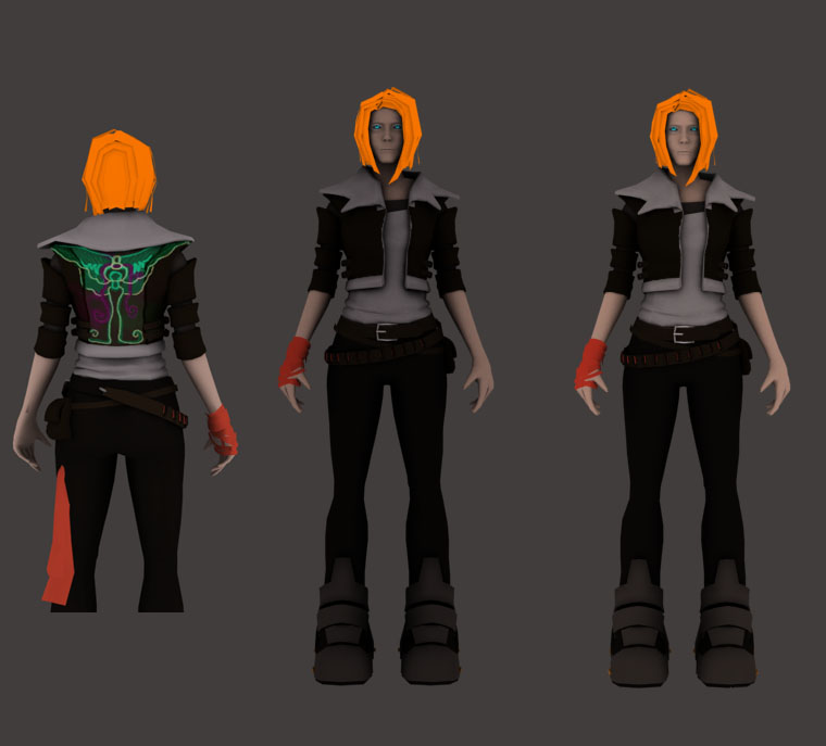
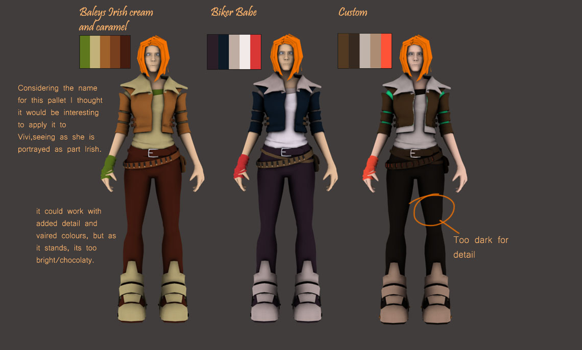
Vivi’s stylised visuals where concepted to show through with whatever neon colours she would have adorned on her person as well as her slightly stylised body.
There were two main aspects that were kep in mind whilst texturing this model, the first being bold colours, that made the character pop out and the second being that the textures them self would look hand painted with as little photo overlays as possible.
The end result ended up being less stylised than hoped, however Vivi does retain certain stylised aspects that keep her from being a realism piece.
Most noticeably is her bright orange neon hair, the neon green and blue jacket bands and her leg sash. Without these elements she would become a fairly bland character who would blend too well with the environment and not pop out as a main character.
The textures themselves were for the most part hand painted, with the occasional use of a photo overlay for time’s sake.
Overall Vivi’s model turned out better than expected, despite not being as stylised as initially thought, the final outcome shows an obvious influence from the heavily stylised games referenced in the pre-production document.

The reason for comparison between these models varies with each model.
Gavin Goulden’s model acts as a great next-gen benchmark for creating what Vivi was meant to be which is a futuristic, slightly badass female.
Lilith from the game Borderlands was a visual aid for poly count. With 13k triangles she fell very close to what I was working with and she also supported the stylistic theme.
Lastly, Ninja Booty, a model created by Slipgatecentral who has had close work with Blizzard Entertainment. This artist is a great example for how textures can really make a model, something that I really wanted to try and achieve.

http://www.polycount.com/forum/showthread.php?t=81829 – Ninja Booty model


Vivi’s model was my first real stab at creating a portfolio piece and the final result turned out to be a model that I could be happy with. Naturally as with any art, its always possible to do better, but for a first time model I was happy to have at least taken a character through the pipeline fully and come out the other side with a decent enough character.
The real success however was in the experience, which can now be taken into account when creating other models and projects that will ultimately help make me a better artist be it 3D or 2D.


 This link: http://www.3dartistonline.com/tutorials.php Will take you to the 3Dartist website where you can download the files for this model to view.